What is a Dashboard? 5 steps to build an effective Dashboard for businesses
A dashboard is a tool that synthesizes and visualizes data, helping managers monitor performance and make quick decisions. More than just displaying metrics, dashboards also play a crucial role in business administration and analysis. In this article, 1Office will help you understand what a dashboard is, its practical role, and 5 steps to build an effective dashboard.
Mục lục
- 1. What is a Dashboard?
- 2. The Difference Between Dashboards and Reports
- 3. The Role of Dashboards for Businesses
- 4. The Most Popular Types of Dashboards Today
- 5. 5 Steps to Build a Dashboard Quickly and Professionally
- 6. Criteria for Evaluating an Effective Dashboard
- 7. Collection of 10+ Detailed Dashboard Templates for Each Department
- 7. 1Office – Software for Automatic Dashboard Report Extraction
- 8. Conclusion
1. What is a Dashboard?
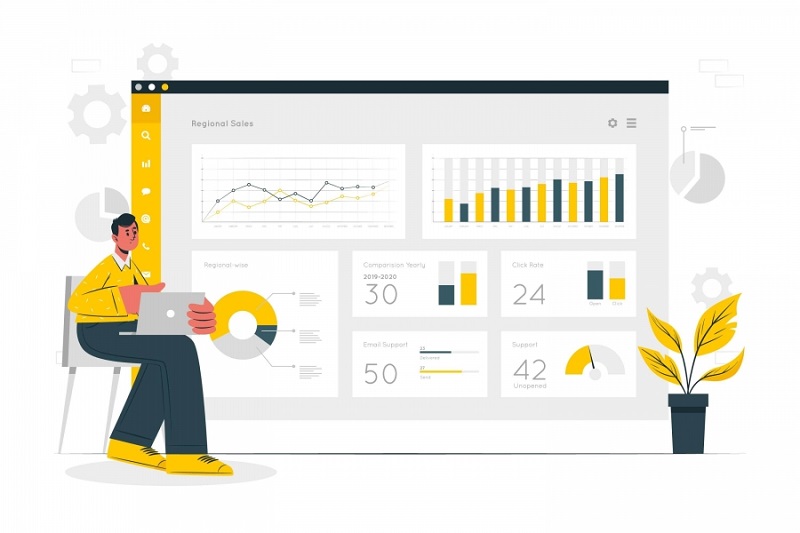
A dashboard is a visual interface that synthesizes and presents data in the form of charts, tables, or metrics. It allows users to monitor work performance and make quick decisions based on real-time data.
>> See more: Top 10 Best Work Reporting Software for Quick and Visual Reporting
2. The Difference Between Dashboards and Reports
Many people often mistake a dashboard for a type of report. However, dashboards and reports are completely different concepts. They each serve specific business needs, as detailed below:
| Dashboard | Report | |
| Objective | Provides a quick, high-level overview of important data. | Provides a more detailed and comprehensive analysis of data. |
| Characteristics | Visual interface, often containing charts, graphs, images, and concise metrics. | A text document or set of documents, containing charts, data, analysis, and explanations. |
| Usage | For continuous monitoring and management, helping users get an overview and make quick decisions. | Provides detailed information, analysis, conclusions, and recommendations for reference. |
| Type of Information | Trends, performance, key indicators. | In-depth analysis, results, parameters, explanations. |
| Format | Visual, graphical interface. | Text-based document or set of documents. |
| Update Frequency | Usually updated continuously. | Usually generated periodically or on demand. |
3. The Role of Dashboards for Businesses
In the Industry 4.0 era, using dashboards has become an essential part of business operations and information management. The roles of a dashboard for a business are:
- Track multiple KPIs and metrics simultaneously: Dashboards help consolidate information and statistics from multiple sources in real-time. This allows businesses to grasp, manage cash flow, and manage business activities more effectively without spending much time and effort.
- Present data visually and more comprehensibly: Instead of reading discrete numbers, dashboards display data in the form of intuitive and prominent charts and images. This helps businesses quickly understand the information.
- Support sharing and collaboration features: Dashboards allow users to share information with relevant parties as needed. This enables managers and personnel to capture information in a timely, fast, and synchronized manner.
- Make reporting easier: Dashboards help businesses automatically generate reports based on existing data. Businesses will not need to compile or search for information from scratch.
- Optimized for mobile devices: Dashboards allow for tracking and management from both phones and laptops. This enables users to monitor information anytime, anywhere, and update data in real-time.
>> See more: What is the Cost of Goods Sold?
4. The Most Popular Types of Dashboards Today
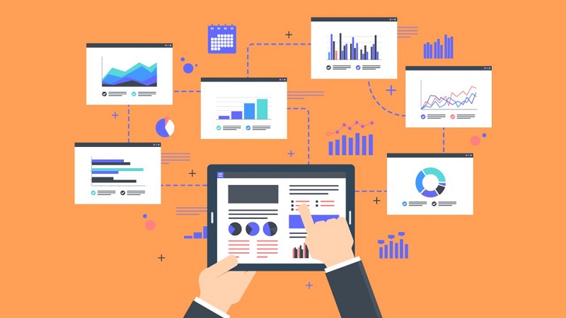
In general, dashboards are displayed in the form of charts, metrics, and images. Depending on different purposes and usage needs, dashboards are divided into the following 7 common types:
4.1. Business Dashboard
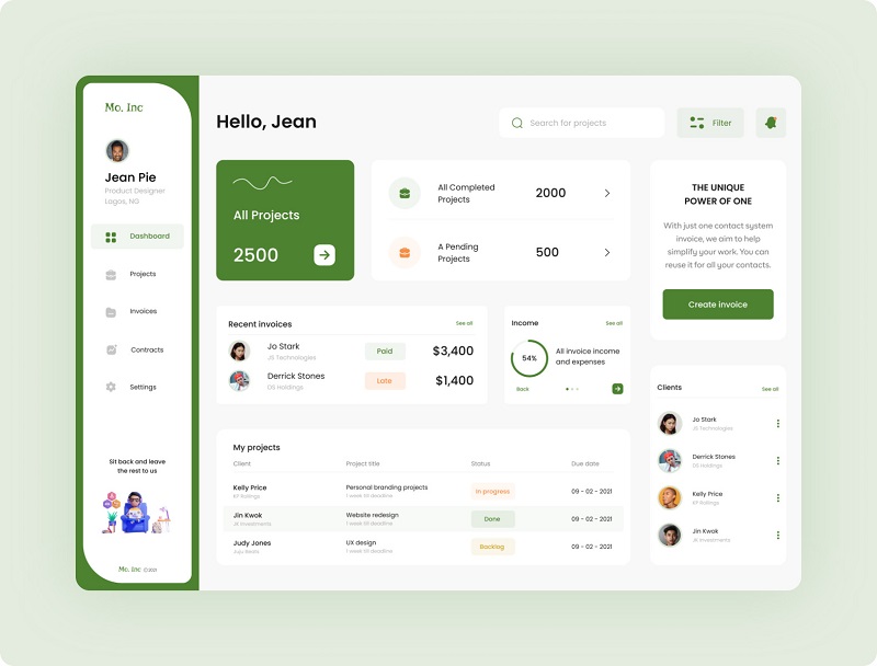
A Business Dashboard is a control panel containing company information related to areas such as finance, sales, management, marketing, and human resources. It helps businesses get a comprehensive overview of their business operations.
This allows businesses to manage overall operations and optimize business decisions. It helps management develop new strategies, forecast the market, track business performance, and identify issues that need to be addressed.
Typically, Business Dashboards are used by executives, leadership teams, and those involved in managing the overall strategy of the business.
4.2. Executive Dashboard
An Executive Dashboard is a control panel that provides a specific overview of the company’s business situation. It displays the highest-level and most important metrics to help managers make quick decisions.
The primary users of an Executive Dashboard are senior leaders, including CEOs, executives, and other high-level managers.
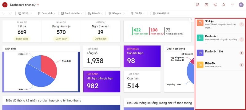
4.3. KPI Dashboard
A KPI Dashboard is a control panel focused on displaying key performance indicators (KPIs) in the form of charts or graphs to show progress and performance. This type of dashboard helps users track the progress of important KPIs, allowing them to make adjustments and improvements.
KPI Dashboards are used by process managers, project managers, and performance trackers to ensure KPI targets are met.
4.4. Project Dashboard
A Project Dashboard is a control panel that helps businesses track project progress and provides detailed information on key factors such as schedule, resources, and risks. This allows the business to effectively implement activities and anticipate adverse situations for timely resolution, ensuring the project is completed successfully.
The users of a Project Dashboard are typically project management teams, project members, and other relevant stakeholders.
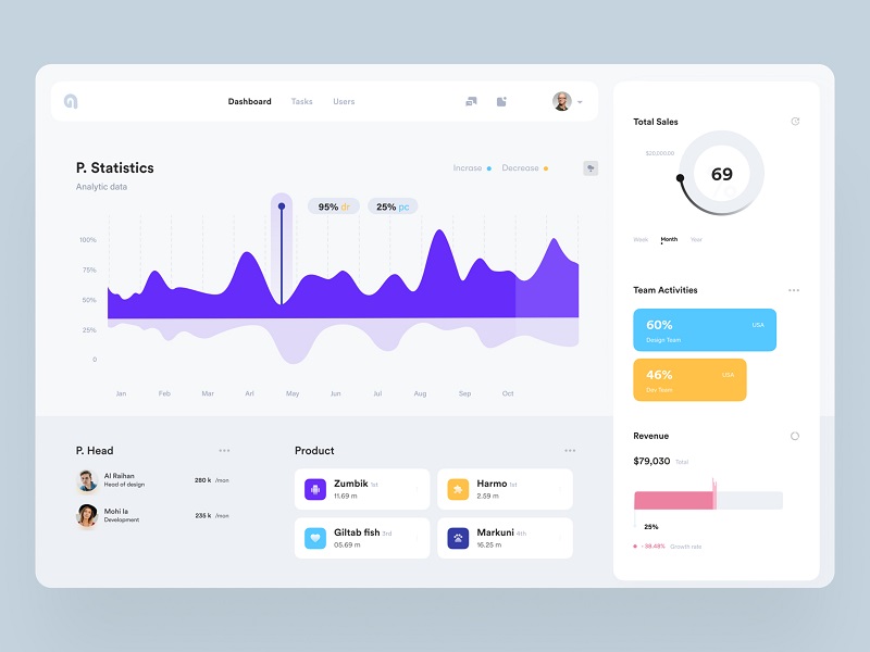
4.5. Performance Dashboard
A Performance Dashboard is a control panel used to measure and optimize business performance in various fields. Performance Dashboards are typically presented mainly in the form of charts and graphs to compare performance, often from different perspectives.
Performance Dashboards help managers and specialists track performance and evaluate the success of business activities.
Performance Dashboards are often used in marketing, finance, advertising, and other departments to measure and optimize performance.
4.6. Website Dashboard
A Website Dashboard is a dashboard that tracks website performance, including information about traffic, users, and e-commerce activities. The main benefit of this dashboard is that it helps website managers monitor growth, evaluate website performance, and optimize the user experience.
4.7. Operations dashboard
An Operations Dashboard tracks the daily activities of a business, providing a comprehensive overview of operational performance. Businesses can use an Operations Dashboard to monitor daily business activities and ensure efficiency.
An Operations Dashboard is typically used by operations teams and managers to maintain daily business activities.
5. 5 Steps to Build a Dashboard Quickly and Professionally
Step 1. Define Objectives and Audience
First, you need to define clear objectives for the dashboard. To determine the dashboard’s purpose, answer these questions: What will you use the dashboard for? What do you want to achieve by creating the dashboard? For example, a business might create a dashboard with objectives like tracking monthly revenue, managing project progress, or monitoring overall performance indicators.

Next, identify the audience who will use the dashboard. Clarify two main points: who they are and what permissions they will have when using the dashboard. For example, a CEO might want to monitor a business overview, while a project manager needs to track the progress of specific projects.
Step 2. Select Data and Data Sources
Based on your objectives, identify the important and necessary data to serve your desired goals. Examples include data on revenue, number of orders, conversion rates, inventory, etc.
Also, in step 2, you need to clearly identify the data sources for the dashboard. Data can come from CRM systems, SQL databases, Excel files, Google Analytics, etc.
Step 3. Choose Charts and Layout
The next step is to choose the right type of chart for the data. Based on the type of data you have, select the most suitable chart. Common chart types include: bar charts, line charts, pie charts, etc.
The information should be arranged in a scientific and logical manner. Arrange the visual components so that the reader can easily follow, from important information to detailed information.
Step 4. Build and Customize
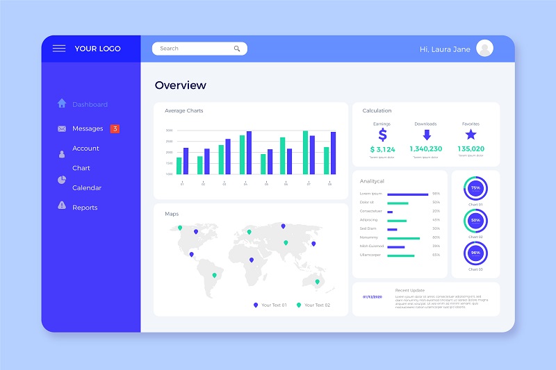
Once you have a complete data system, you can use dashboard creation tools like Microsoft Power BI, Tableau, Google Data Studio, etc., to build the dashboard. You can customize the interface and set elements like colors, fonts, and icons to match your company’s brand.
Additionally, businesses can easily create automated dashboards directly on the 1Office all-in-one business management system. Data on customers, personnel, tasks, etc., are all easily managed and synchronized by the software. Depending on your dashboard needs, you can easily create multiple dashboards with an accuracy of up to 99.99%.
Step 5. Test and Improve
Finally, carefully check the data used to create the dashboard to ensure accuracy. At the same time, check how it displays on different devices such as computers, mobile phones, and tablets.
To ensure the dashboards are as effective as possible, you cannot skip collecting feedback from users of the dashboard template. Through this feedback, you can edit and optimize the dashboards.
6. Criteria for Evaluating an Effective Dashboard
An effective dashboard is not just beautiful; it must also convey information accurately, promptly, and support action. Below are five core criteria (with explanations, metrics, and practical notes) for evaluating any dashboard.
6.1. Visualization
Visualization is the ability to transform raw data into images—charts, maps, scorecards—so users can quickly grasp its meaning.
Specific requirements:
-
Use appropriate charts (e.g., use line charts for time trends, bar charts for comparisons, and pie charts very sparingly only for simple proportions).
-
Arrange visuals in order of information priority: important KPIs at the top/top-left corner.
-
Use colors purposefully: accent colors for calls to action, neutral background colors for context.
-
Ensure clear scales, axes, and labels; avoid data distortion (no truncated axes, no misleading 3D charts).
Relevant metrics/KPIs:
-
Average time for users to identify key KPIs (Usability test).
-
Rate of chart interpretation errors in internal surveys (% of users who misunderstand).
-
Number of times users complain/ask for chart explanations in a month.
Notes & common mistakes:
-
Too many charts on one screen causing clutter (chart junk).
-
Using too many colors makes it difficult for viewers to focus.
-
Choosing the wrong chart type, leading to data misinterpretation.
6.2. Smooth Data Integration – Real-time Updates
The dashboard must display accurate, timely data and have a clear update process — from ETL and data cleaning to source refresh.
Specific requirements:
-
Clarity on update frequency: real-time, near-real-time, hourly, daily — must display the timestamp of the latest data.
-
Integrate data from multiple sources (CRM, ERP, marketing, analytics) with consistent transformations and mapping.
-
Data quality control (data validation rules, alerts for missing data or outliers).
-
Have a fallback/cache mechanism for when the source fails to prevent the dashboard from going down completely.
Relevant metrics/KPIs:
-
Latency: the time from when data is generated at the source to when it is displayed on the dashboard.
-
Percentage of erroneous/missing data on the dashboard (%).
-
Number of connection error alerts from the dashboard in 30 days.
Notes & common mistakes:
-
Not displaying a “last updated” timestamp erodes user trust.
-
Connecting directly to the OLTP system generates high load, affecting the main system’s performance — a data warehouse/streaming layer should be used.
-
Incorrect synchronization between sources leads to conflicting data.
6.3. Customization Capabilities for User Needs
An effective dashboard must allow for personalization — filtering by time, region, department; saving configurations; and/or building separate views for each role.
Specific requirements:
-
Flexible Filter/Drill-down/Drill-through: users can narrow down the scope (e.g., from year → month → day → order).
-
Roles & permissions: each role (executive, manager, analyst) has appropriate views and access rights.
-
Customizable layout & widgets: allow saving “personalized views” or templates.
-
Easy Export/Share: PDF/PNG/CSV and shareable links with permissions.
Relevant metrics/KPIs:
-
Percentage of users who use filter/drill-down features in a session.
-
Number of views saved/created by users.
-
Time to set up a new view (time-to-customize).
Notes & common mistakes:
-
Providing too many complex options confuses general users.
-
Lack of permission control — unauthorized users can still see sensitive data.
6.4. Usability and Readability
Usability focuses on the experience: easy to read, easy to interact with, and a short initial learning curve. The dashboard must be friendly to users who are not data experts.
Specific requirements:
-
Use simple language, avoiding technical jargon if the users are non-technical.
-
Logical layout: group information by task/objective (e.g., Sales overview → Funnel → Product details).
-
Provide quick guidance (onboarding tips, tooltips, legends, help icons).
-
Accessibility: sufficiently large fonts, good contrast, and compatibility with screen readers when needed.
Relevant metrics/KPIs:
-
Task completion rate in usability tests.
-
SUS (System Usability Scale) score or internal NPS.
-
Number of support requests/helpdesk calls related to the dashboard.
Notes & common mistakes:
-
Small text, unclear icons, lack of annotations.
-
No guidance for complex metrics (e.g., how KPIs are calculated).
6.5. Ability to Support Quick Decision-Making
The ultimate goal of a dashboard is to aid decision-making — detecting anomalies, prioritizing actions, and tracking results.
Specific requirements:
-
Information hierarchy: KPI summary (high-level) + insight cards + recommended actions.
-
Alerts & thresholds: automatic warnings when metrics exceed thresholds, with context (e.g., possible causes).
-
Storytelling: allow combining sequence charts/annotations to tell a data story (e.g., “Sales decreased by 12% after campaign X”).
-
Quick analysis: support drill-to-detail, cohort analysis, and period comparisons to identify root causes.
Relevant metrics/KPIs:
-
Time from problem detection to action (time-to-action).
-
Percentage of decisions based on the dashboard (%) (survey).
-
Number of useful events/alerts (precision of alerts) — low false positive rate.
Notes & common mistakes:
-
Too many alerts/lack of context → causes “alert fatigue”.
-
The dashboard only presents data without suggesting specific actions.
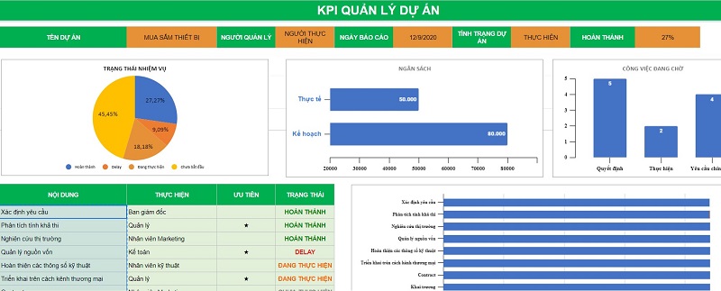
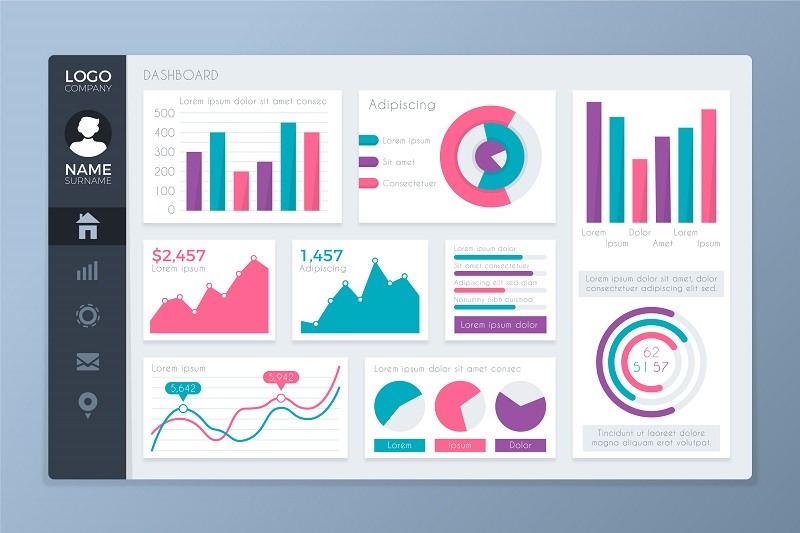
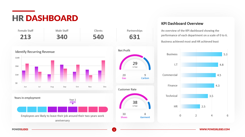
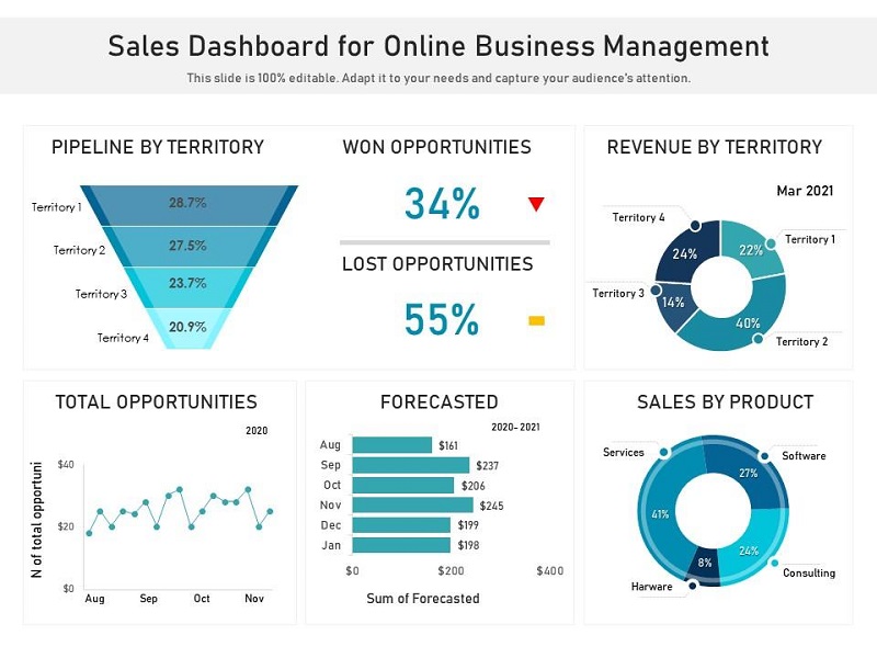
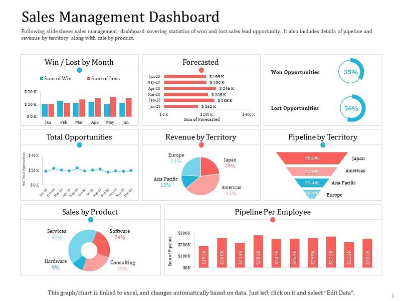
7. Collection of 10+ Detailed Dashboard Templates for Each Department
Dashboard Template for Accounting
Dashboard Template for Human Resources
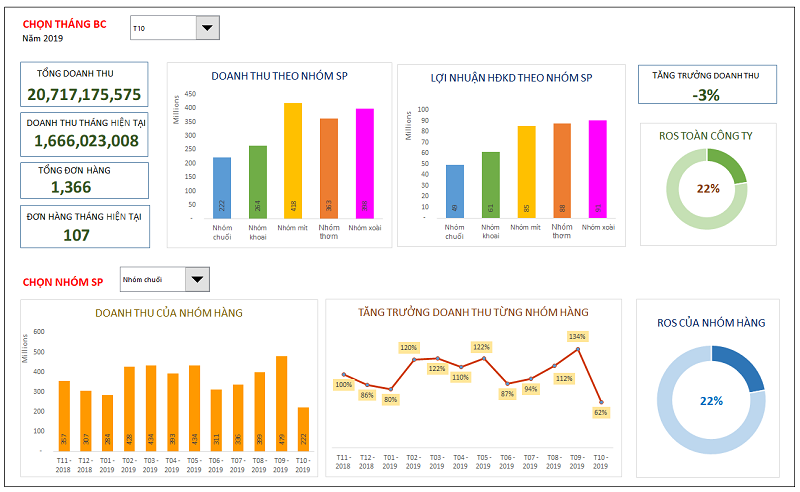
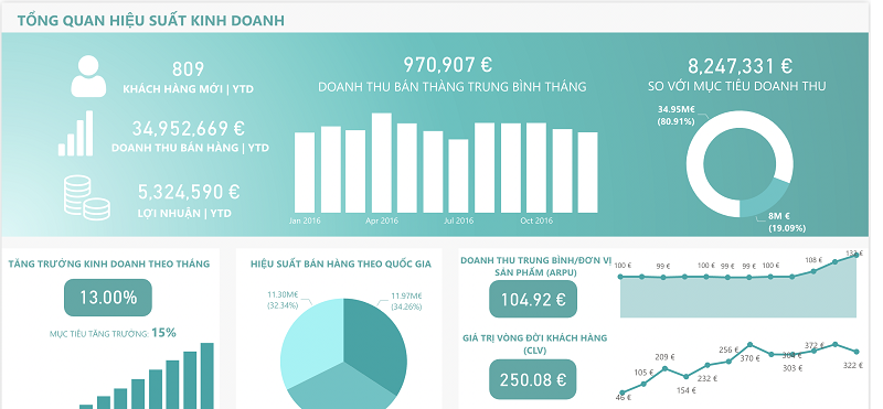
Sales Dashboard Template
Business Management Dashboard Template
7. 1Office – Software for Automatic Dashboard Report Extraction
1Office is a leading effective business management software today. In addition to the outstanding capabilities the software provides for managing, monitoring, and coordinating business activities, it also helps businesses extract Dashboard reports automatically and quickly.
With just a few simple steps, your business can build multiple Dashboards simultaneously as desired. The software supports businesses in creating a variety of Dashboard types, from a general business overview to details for each department, project, or individual.
8. Conclusion
In summary, a dashboard is not just a data visualization tool, but also an “analytical assistant” that helps managers grasp the overall picture of business operations visually, accurately, and in a timely manner. Applying business management software like 1Office will help businesses easily build professional dashboards, customized to management objectives, and improve decision-making efficiency. Start your digital transformation with these smart dashboards today